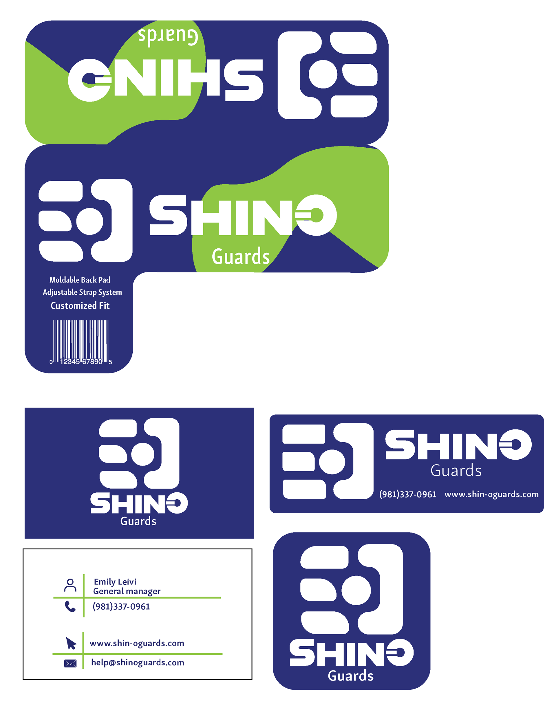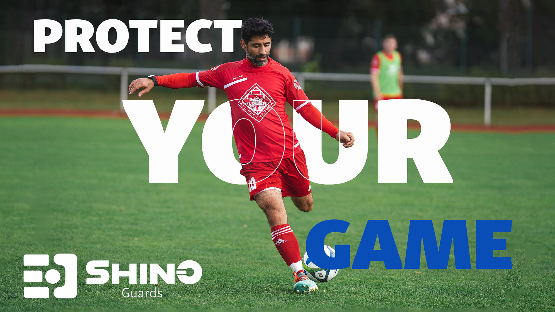
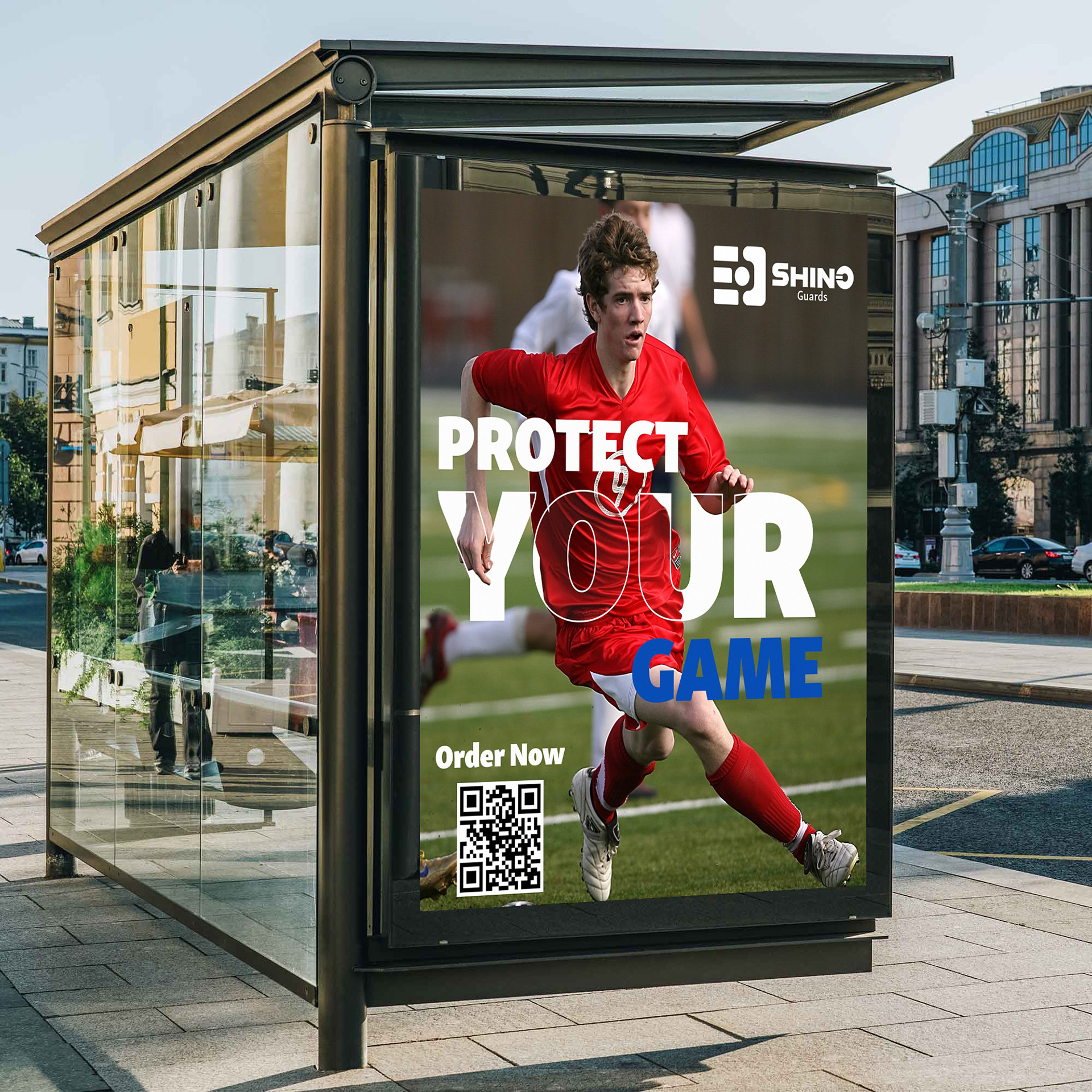
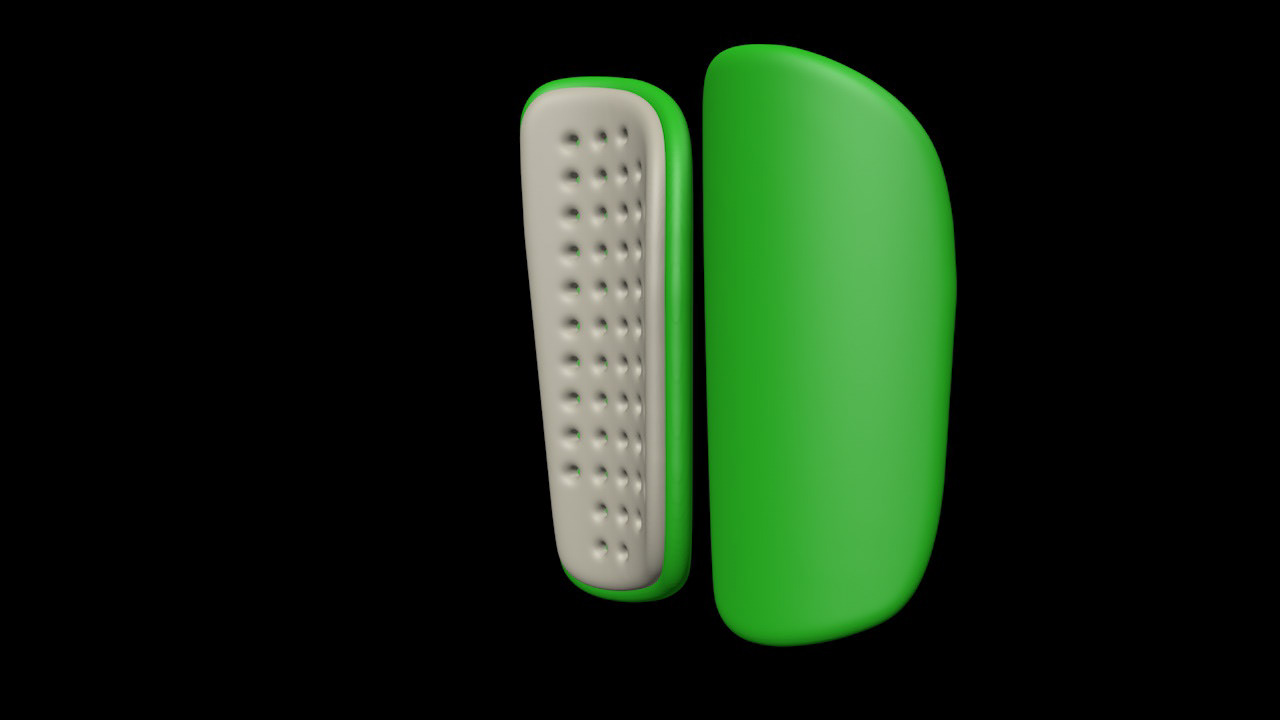
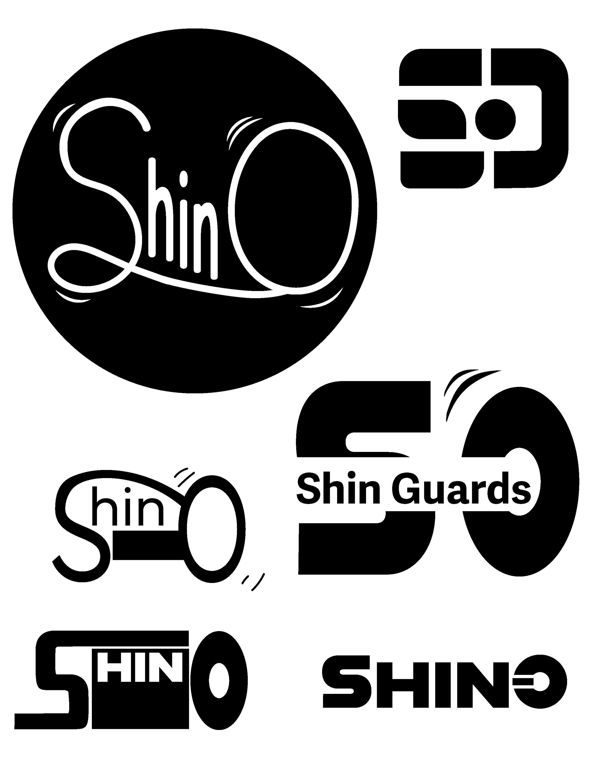
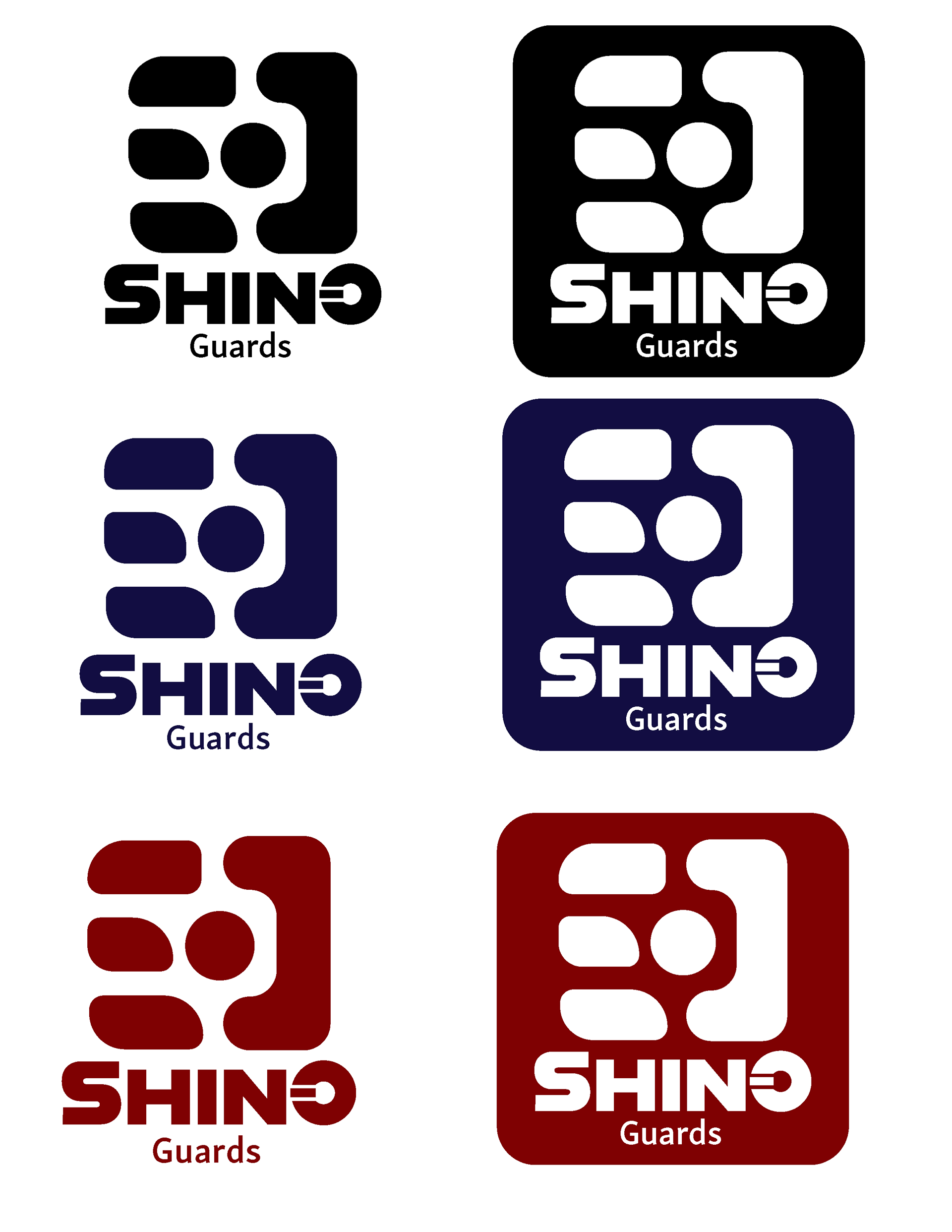
Above you can see the logo development that I walked through to get to the logo that is shown below. I wanted to create something that felt strong and would want to make soccer players buy this product. The final logo has a representational S on the left side and a half of an O on the right to show the two important letters in the name. As we look closer we can that there is a representational soccer goal made from the half-O on the right and a representational soccer ball in the middle of the logo. The O in the name also has a rectangle in it which links the name to the representational logo above it. The whole shape logo is representational of a cross hair which is commonly used to practice hit spots in a goal. Shown below are the marketing documents and the packaging.